Also, sorry in advance for the sound quality. Still learning how to make it louder than a whisper...

Tuesday, November 27, 2012
Fly Wingz (Part2)
Here is the latest version of my DIS project. I still need to add music, re-record some footage/audio, and add some plugs for programs, but other than that it's done! This was my first time working with Flash, and before that I only had a little experience in Illustrator and iMovie, so needless to say this was a challenging/unbelievably frustrating project at times. But I like the way it came out, and so did my professor, which is all that matters, right?
Also, sorry in advance for the sound quality. Still learning how to make it louder than a whisper...
Also, sorry in advance for the sound quality. Still learning how to make it louder than a whisper...
Thursday, November 22, 2012
The Sneeze
This here piece is another one of my favorite projects from my Drawing II class last Spring. I had a very strong love/hate relationship with this piece. I loved it because it's the first piece I've ever done where I felt completely content with the final product. And I hated it because it caused me hours of pain and suffering. I guess I'll start this tale off with the instructions for the project:
1. Incorporate text into the image - at least ten of the words have to be body parts.
2. Only use one color, other than black and white.
These simple instructions proved to be unbelievably difficult for my brain to follow, which led to yet another prolonged sketching period:


We had about a week and a half to come up with an idea and complete the project, and up until the weekend before it was due, I had planned a completely different idea from what I ended up doing. I originally thought about making a diptych of a hand and foot with text in the background explaining why they hated each other/secretly wanted to be each other. But when it came to doing it, I thought, "This is stupid," and turned to Google for more inspiration. That's when I stumbled upon this picture:

I have no idea what this picture was taken for, but I took it and ran with it. My final idea was to make a diptych of this dainty woman sneezing her guts out.
 |
| "The Sneeze," aka "Snot Girl" - done in hard compressed charcoal and chalk pastel |
This project took a total of twenty-four hours worth of physical drawing (twelve hours straight for two days), hence the previous "pain and suffering" comment.
Here is a quick journey through time of the bottom panel:


............................................................................................................................................................


Friday, November 16, 2012
Deep Sea Monsters
This blog is usually about art that I'm currently working, but recently I've been feeling the urge to post about some old pieces I've made. And since it's my blog, I am going to follow that urge.
This was one of my favorite projects from my Drawing II class. Our assignment was to create a book with at least twelve pages of illustration (I think). And that was the extent of the instructions. So basically we could do whatever we wanted! Which means I went through a very prolonged sketching period:


This sketch on the right can be explained by the fact that I was playing Limbo at the time^^^.
After mulling over ideas for way too long, I finally chose a theme: Deep Sea Creatures. I did a lot of research on deep sea organisms and tried my best to find the creepiest ones. (The "Deep Ocean" episode of Planet Earth and "The Deep" episode of Blue Planet were very inspiring, and awesome!) Also, as you can probably guess, there aren't many great full shots of these animals, since their bodies collapse if they're taken out of their high pressure environments, so for some of these I would reference multiple pictures of one animal and just kind of put the pieces together in my drawing. Here are some of the pictures I referenced:

While I was searching the web, I found THIS, one of the most terrifying things you will ever see in your entire life. WHY DOES THIS EXIST.
Anyway, another challenging aspect of this project was the actual process of making the book - which I waited until the last second to think about. I made my pages out of black construction paper, and my shoddy craftsmanship led me to punch holes through them with thumb tacks and use dental floss as the binding:

Yes, it fell a part on me while I was presenting it in class.
(As for the rest of the materials, I just used white charcoal pencil and color pencils for the drawing, and I cut millions of tiny circles out of transparent vellum paper for the jellyfish's body.)
And finally, the story follows the life of a lil' cnidarian through the deep sea, and all of the terrifying things he encounters. I originally tried to write some lines for the book, but since I am the worst writer in the world, I gave up on that very quickly. I like how it turned out, though. I think everyone should challenge themselves and try to explain a story only through pictures.
- Side note: I actually had a page in between each of these drawings that showed the jellyfish swimming away in different directions, but I didn't want to take pictures of all of them. So try to imagine them.
Hope you like it!


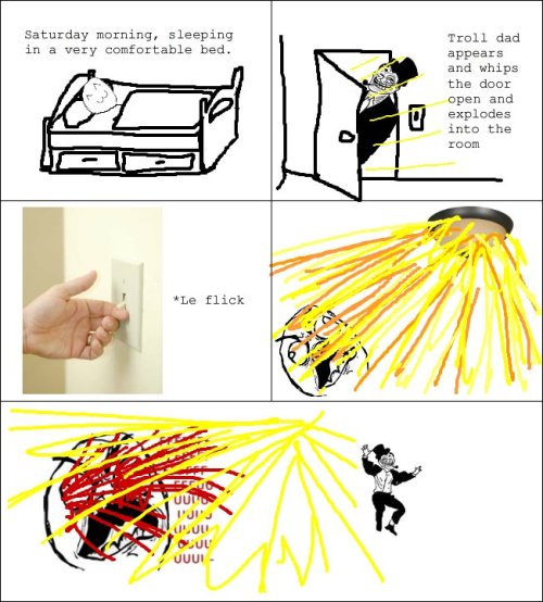
I know you are all thinking it: Troll Dad Eel

Wednesday, November 7, 2012
Illusions, Subtraction, and Desaturated Wasps (Finale)
First and foremost, my Desaturated Wasps project has finally come to a close. Our last two paintings had to consist of all the saturation levels we've worked with so far (chromatic, muted, and prismatic). This project - however boring it may have seemed while I mindlessly went through it - gave me some really awesome tips on how to manipulate mood and lighting with color. And since I love you guys and don't want you to have to pay $500 dollars to learn them on your own, I will list them for you!
This last technique was often used by the seventeenth century painter, Rembrandt. His pieces are famous for the mysterious glowing quality he produced in his subjects. Rembrandt, however, rarely used pure white in his paintings. Instead, he created these shimmering and luminous effects by painting pure yellow, red, and orange on top of an entirely chromatic grey color scheme.
But this stuff is just babytown frolics compared to what we are learning now in Color Theory. Everyone is probably familiar with, or has at least seen the work of, Josef Albers. He is one of the most influential color theorists since the twentieth century and spent more than forty years researching the relativity of color. Albers believed, and proved, that color is never seen as it physically is, and that the perception of color is completely dependent on its surroundings. Our first study of his work was the illusion of creating different values from the same color by changing its background. My teacher let us loose with a stack of three hundred color cards without any hints on how to achieve this, but eventually I discovered some tricks:
Here is an actually good representation from one of Albers' own experiments:

(ps. If you are interested in his work you should check out his book/bible on color theory, Interaction of Colors)
Finally, I'll end this post with my Figure Drawing update. Lately, we have been working with subtractive shading. This is a technique where you cover your paper with a layer of dark medium (in our case, charcoal) and erase the lightest areas of the subject. We did one small practice sketch (first drawing below) and one large final piece (last drawing). For the most part, I only used vine charcoal on her body - with many many layers of fixative - and I used soft compressed charcoal to create the dark shadows in the fabric.
- Chromatic greys (mixtures of multiple hues) create a dull, monotonous, or depressing atmosphere.
- Prismatic colors (pure primary and secondary colors straight out of the tube) create a vibrant, happy, or exciting atmosphere.
- Combining prismatic colors with chromatic greys and muted hues is a way to achieve luminosity without the use of white. (This is what my last two paintings below were meant to prove)
 |
| Combined Saturation Levels (broad range) of a Spider/Hunting Wasp |
 |
| Combined Saturation Levels (narrow dark range) of a Red Wasp |
This last technique was often used by the seventeenth century painter, Rembrandt. His pieces are famous for the mysterious glowing quality he produced in his subjects. Rembrandt, however, rarely used pure white in his paintings. Instead, he created these shimmering and luminous effects by painting pure yellow, red, and orange on top of an entirely chromatic grey color scheme.
 |
| Man in a Golden Helmet, 1650, oil on canvas |
,+rembrandt,+1642,+oil+on+canvas.jpg) |
| Night Watch (detail), 1642, oil on canvas |
 |
| Philosopher in Meditation, 1642, oil on wood |
But this stuff is just babytown frolics compared to what we are learning now in Color Theory. Everyone is probably familiar with, or has at least seen the work of, Josef Albers. He is one of the most influential color theorists since the twentieth century and spent more than forty years researching the relativity of color. Albers believed, and proved, that color is never seen as it physically is, and that the perception of color is completely dependent on its surroundings. Our first study of his work was the illusion of creating different values from the same color by changing its background. My teacher let us loose with a stack of three hundred color cards without any hints on how to achieve this, but eventually I discovered some tricks:
- This works best if you use a medium value color as your tiny square.
- Choose a darker value of the same color as your tiny square for one of the backgrounds.
- For the other background, use a light value of any color.
And "veni vidi vici" (God, I miss Doug <-- also why is there not a better quality version of this on YouTube), you have created two different values from the same color. It's kind of iffy with a couple of the squares I made.. but the best way to see the effect is to look at the division of where the two backgrounds meet.
 |
| 1 Color, 2 Values study |
Here is an actually good representation from one of Albers' own experiments:

(ps. If you are interested in his work you should check out his book/bible on color theory, Interaction of Colors)
Finally, I'll end this post with my Figure Drawing update. Lately, we have been working with subtractive shading. This is a technique where you cover your paper with a layer of dark medium (in our case, charcoal) and erase the lightest areas of the subject. We did one small practice sketch (first drawing below) and one large final piece (last drawing). For the most part, I only used vine charcoal on her body - with many many layers of fixative - and I used soft compressed charcoal to create the dark shadows in the fabric.
 |
| figure study using subtractive shading - done in vine and compressed charcoal (30min) |
 |
| Subtractive Project (Days 1-2) |
 |
| Subtractive Project (final) - done in vine and compressed charcoal |
Subscribe to:
Posts (Atom)